Employee AI Assistant
Design strategy
Simple
Visual layout of the interface needed to be simple, despite the complex features the AI had. This was especially true for novice users. Elements also needed to follow users' expectations from competitors' applications.
I leveraged a strong hierarchy to minimize surface-level clutter. Experienced users would find customizability when they dug in a little.

The Chat feature has three main options to guide new users: suggested topics to start the conversation (1); free text entry to continue the conversation (2); and a button to open a new chat (3).
Unified
I designed the application to be modular and consistent, following brand style guidelines. Having this consistency helps users recognize visual elements, infer their functions, and ultimately work confidently.

Standard visual elements are used in the Document Q&A feature, which begins with selecting a collection.

The Prompt feature begins in the same way as the Document Q&A—selecting an item from the table.
Intuitive
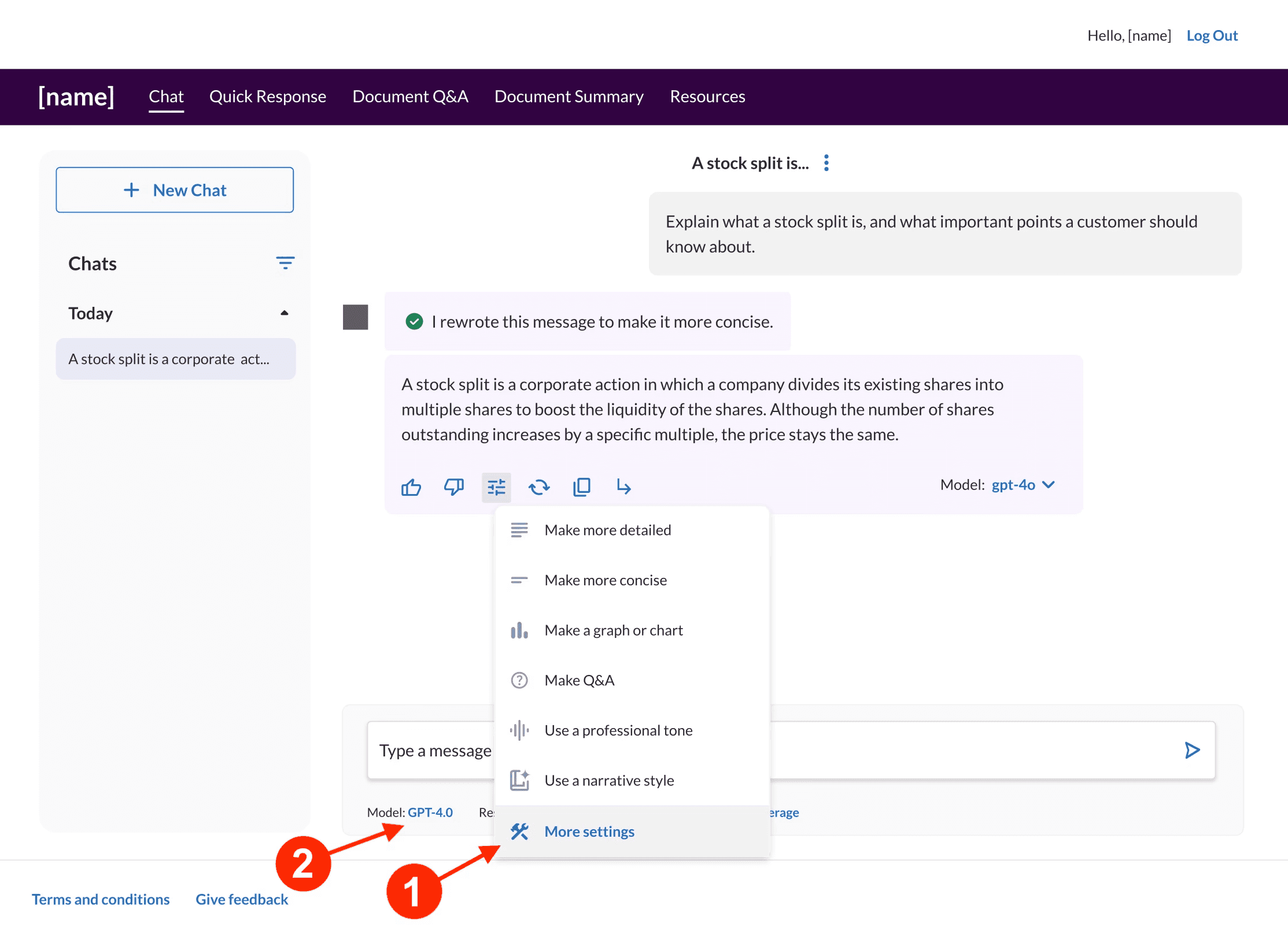
It's crucial to meet users where they are. I drew on competitive analysis to align features with users' mental models. In this example, I separated the settings that modify a single response from the settings that modify the continuing conversation.
I balanced logical, hierarchical placement with convenience. For modifying a response in Chat, I put frequent actions (e.g., "Make more detailed") in the drop-down menu on the response. Users can dive deeper into "More settings" for further customization.


Accessible
To serve and guide all employees, I added annotations detailing the functions of UI elements. I wrote descriptive alt text to bring clarity and a smooth flow between actions.

Visual hierarchy communicates a lot in this comparison of AI responses, so I knew I needed detailed annotations to provide the same level of info to users with low vision.
Responsive
I planned an interface aligned with brand standards that reacts to the users' input. Even novice users have expectations for how digital experiences respond to their input.
Both instant and delayed feedback reduce user anxiety, affirming receipt of input or explaining internal processes.
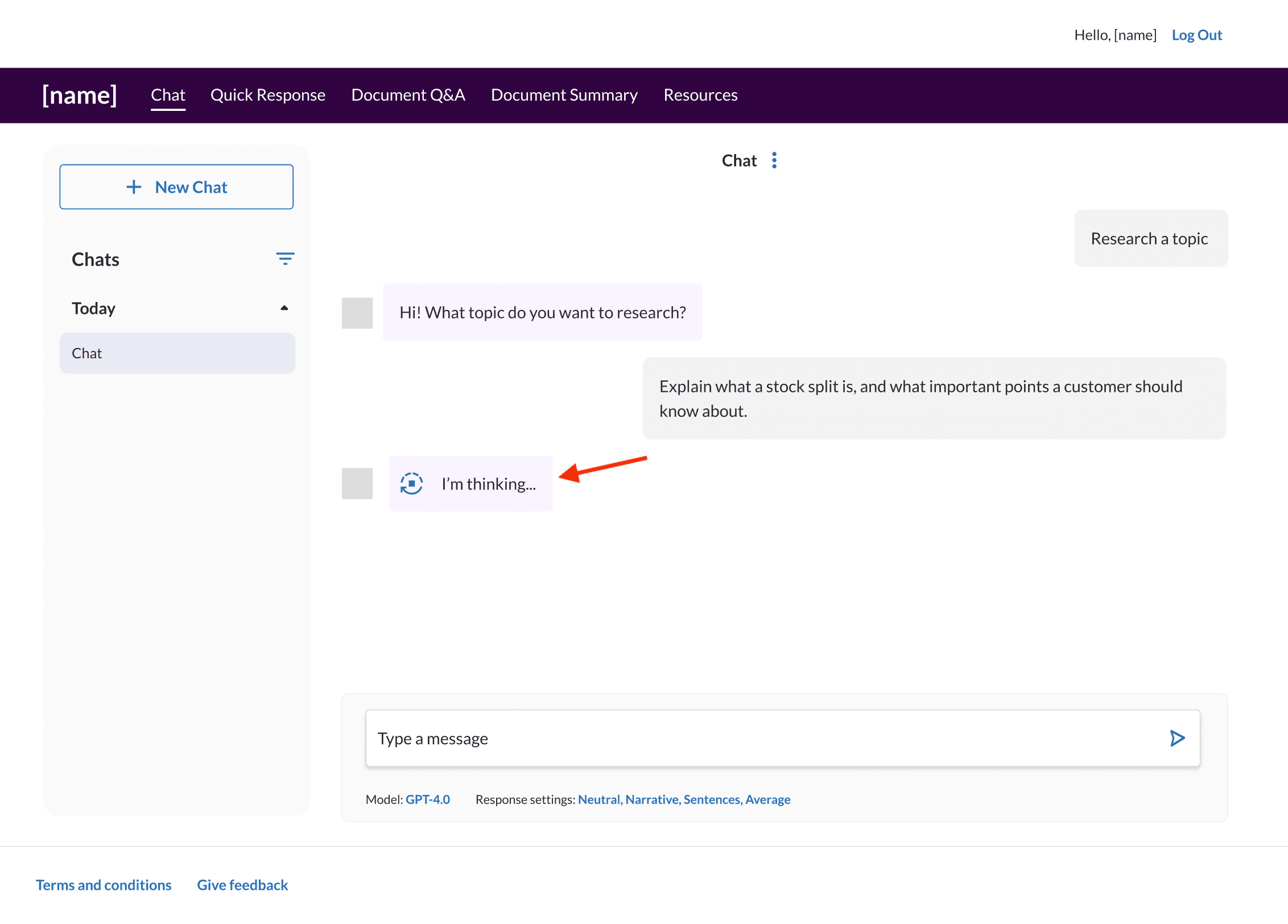
A moving icon and content in the AI's text bubble tell the user that the application is processing a response.

Destructive actions (like deleting a conversation) have attention-grabbing responses.

A banner at the top of the screen confirms the user successfully completed their task.
Customizable
Employees' needs differ across teams and individuals. I gave flexibility to the application so users can mold it to their workflow.

The app now retained past conversations, so organization by date and search filters were necessary.
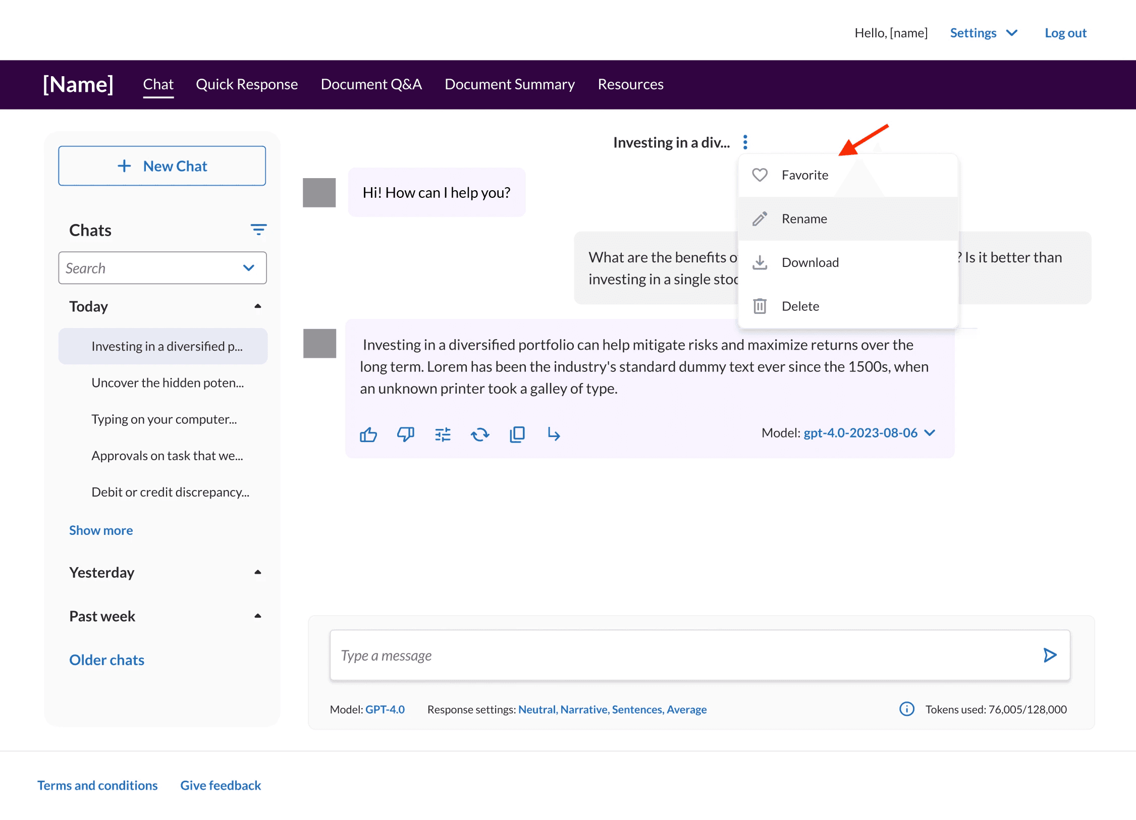
I added cataloguing attributes to help users organize their conversations.